
Table of Contents
- Start With User Goals
- Choose the Right Layout
- Organize Filter Options
- Make Filter Logic Clear
- Design for Mobile
- Provide Clear Feedback
- Build Accessible Controls
- Handle Empty Results
- Test Before Launch
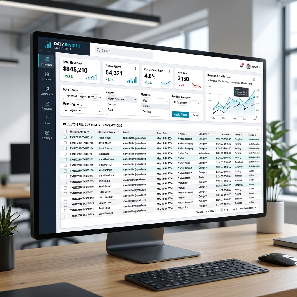
Filters help people make sense of large product catalogs, property listings, job boards, media libraries, dashboards, and knowledge bases. When they work well, they reduce noise without making users feel trapped in a complicated control panel. Reviewing examples of filter panel UI can also help teams spot familiar patterns before deciding how their own experience should behave.
A useful filter system does more than shrink a list. It gives users confidence that they can narrow results, understand what changed, and reverse a decision whenever necessary. Whether someone is shopping for shoes by size and price or searching a reporting dashboard by date and region, the experience should remain visible, predictable, and easy to control.
Start With User Goals
Begin with the decisions users are trying to make, not with every field available in the database. A shopper may care about size, price, color, and stock status. A person searching for apartments may care about location, rent, bedrooms, and pet policies. Identify the few choices that help most people reach a useful result quickly, then place advanced options behind an expandable section when appropriate.
Labels should use the words people already use. Search queries, customer support requests, interviews, and usability sessions can reveal whether visitors say “under $100,” “budget,” “price range,” or something else entirely. Familiar language lowers the effort required to scan and choose.
Choose the Right Layout
The best layout depends on screen size, the number of filters, and whether users need to compare results while refining them. There is no single pattern that fits every collection.
- Sidebar filters work well on wide desktop screens with detailed datasets and many categories.
- Top-bar filters suit pages with a small number of high-value controls, such as category, price, and availability.
- Inline filters fit reports and tables where users need to adjust a focused view without leaving the data.
- Drawers and overlays conserve page space when a filter set is large, but should not dominate the results.
- Full-screen mobile views give long option lists enough room for touch-friendly selection.
Keep the result list visible whenever possible. If filtering causes the page to feel disconnected from the items being changed, users may lose their sense of progress.
Organize Filter Options With Care
Put the most useful controls first and group related choices under short, familiar headings. A property search, for example, might begin with Location, Price, Property Type, and Bedrooms, followed by less common amenities such as parking, a balcony, or a pool. Long, flat lists force unnecessary scanning and make the interface feel more difficult than the task itself.
Use Progressive Disclosure
Show common options immediately and reveal specialized controls only when users ask for them. Add search within an option list when there may be dozens of brands, locations, tags, or attributes. Counts can be helpful when they indicate what remains available, but avoid updating them in a way that distracts users or makes every choice look like a warning.
Make Filter Logic Clear
Hidden logic is one of the fastest ways to make a filter system feel broken. Most filters combine categories with AND logic, meaning a result must meet every selected condition. Within a category, multiple acceptable options often use OR logic, so selecting blue and green shows either color. Price, date, and distance controls usually rely on ranges.
Explain unusual behavior in plain language near the control. If visitors can select several brands, say that clearly. If selecting a category removes incompatible options, make the change understandable rather than silent. Visible result updates reinforce the relationship between a choice and its effect.
Design for Mobile Screens
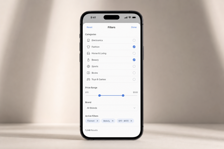
Small screens demand a more deliberate approach. Keep a Filter trigger visible as users scroll, show the number of active selections beside it, and use large touch targets with comfortable spacing. A full-screen filter view is often easier to use than a cramped popover, especially when people need to select from long lists.
When instant updates would cause jarring page movement, provide a clear “Show Results” action. After the panel closes, display selected filters as removable chips above the results. Research on applied filter overviews shows why users need immediate confirmation, context for the current list, and a quick way to remove choices without reopening the menu.
Provide Clear System Feedback
Every selection should produce an understandable response. Use obviously selected states, update the result count, and show a lightweight loading indicator if data needs time to refresh. “12 results found” is far more reassuring than a silent page refresh because it confirms that the system received the action.
Include both individual removal controls and a Clear All action. Preserve the filter state when someone opens a detail page and returns to the list. Otherwise, users may have to repeat a careful search simply to compare two items.
Build Accessible Controls
Filters must work with keyboards, screen readers, touch input, zoom, and voice controls. Every control needs a descriptive label, visible keyboard focus, and a logical tab order. Group related checkboxes or radio buttons under a clear heading, and manage focus correctly when a drawer or overlay opens and closes.
Do not rely on color alone to show a selected state. Use text, checkmarks, borders, or icons as well. The guidance for accessible formsreinforces the importance of labels, grouped controls, instructions, and feedback that users of assistive technology can understand.
Handle Empty Results Well
A zero-result page is not the end of the journey. Explain that no matches were found, keep the current selections visible, and offer a one-click way to remove the most restrictive filters. For example, a travel search with a narrow date range, low budget, and specific neighborhood could suggest expanding the dates, increasing the budget, or viewing nearby areas.
Test Before Launch
Test with realistic tasks across desktop, tablet, and mobile. Watch for pauses, backtracking, repeated menu openings, and uncertainty about which filters are active. Test low-result and zero-result combinations, slow connections, keyboard navigation, and screen reader behavior.
Track task completion, time to find a suitable result, filter removal errors, zero-result frequency, and abandonment during filtering. A strong filter experience keeps choices understandable, reversible, and useful, helping users move from an overwhelming list to a confident decision.
Discover more from The Cameron Journal
Subscribe to get the latest posts sent to your email.