
Table of Contents
- Understanding User Expectations
- Choosing the Right Time Format
- Ensuring Touch-Friendly Interactions
- Maintaining Consistency with Platform Guidelines
- Providing Clear Feedback and Error Handling
- Considering Accessibility
- Testing and Iterating
- Conclusion
Time pickers are essential elements in modern mobile applications, allowing users to select exact times for a range of tasks, including scheduling, reminders, and appointments. A thoughtfully designed time picker not only improves the speed and ease with which users enter information but also minimizes errors and user frustration. Reviewing different time picker UI approaches offers valuable insights into widely accepted design patterns and inspirations for various platforms.
Designers looking to optimize the user experience should focus on simplifying interactions, ensuring accessibility, and adhering closely to established conventions. Understanding how to align time picker interfaces with user expectations provides a foundation for delivering intuitive solutions that reduce friction in mobile workflows.
Understanding User Expectations
When users interact with mobile time pickers, they anticipate an interface that is immediately clear and easy to control. Unnecessary complexity, such as multiple pop-ups or convoluted time selection steps, is frustrating and time-consuming. Designers can anticipate common needs, such as defaulting to current times for calendar events or offering preset intervals like 15, 30, or 60 minutes, which streamlines the user journey and reduces input effort.
It is essential to recognize that mobile users often need to accomplish tasks quickly, sometimes in distracting or fast-moving settings. Building time pickers that minimize choices and speed up interaction directly contributes to higher satisfaction and better usability. The ideal picker does not require users to think twice about whether they have selected the right time or if their input will be properly recorded.
Choosing the Right Time Format
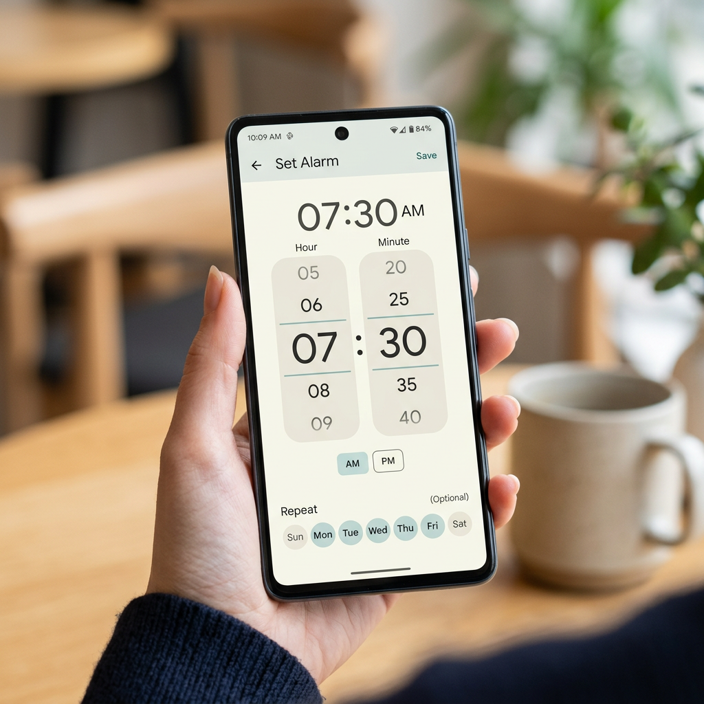
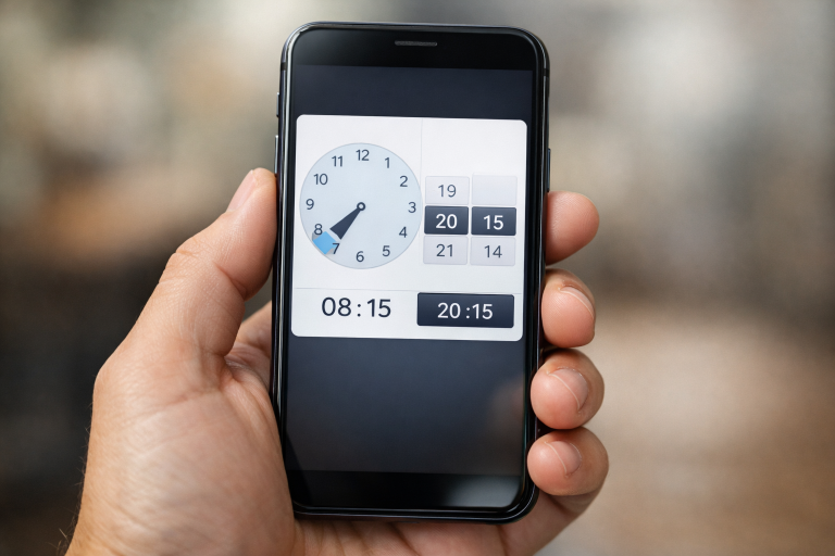
One of the core decisions in time picker design is selecting between a 12-hour or 24-hour format. The 24-hour format eliminates ambiguity between AM and PM, which can be especially helpful for scheduling events that may cross over noon or midnight. On the other hand, users in North America and a number of other regions are more accustomed to the 12-hour clock. It is advisable to either use the regional preference as the default or allow users to choose their favored display format via mobile device settings or a toggle in your application.
Clarity is paramount. Clearly label AM and PM states if you provide a 12-hour option. Mismatches between what the user expects and what is displayed can lead to critical scheduling mistakes, especially in productivity or medical apps. Ensuring that the format aligns with user expectations demonstrates respect for their familiar habits. For a deeper dive into effective mobile interfaces, review best practices compiled by the Nielsen Norman Group.
Ensuring Touch-Friendly Interactions
Nearly all mobile interfaces rely on touch as the primary input method, so time pickers must have sufficiently large touch targets. Apple’s iOS Human Interface Guidelines and Google’s Material Design both recommend a minimum touch surface of 44×44 pixels to accommodate users with different finger sizes and to prevent incorrect selections. Additional features, such as swipe gestures for fine-tuning minute or hour selection, can offer a more fluid user experience and reduce the need for precise tapping.
Feedback on selection, such as a highlighted or enlarged number, reinforces to users that their input has been captured. An intuitive user interface also minimizes the risk of overlooked selections or errors, facilitating a more pleasant experience on both small and large mobile screens.
Maintaining Consistency with Platform Guidelines
Each major mobile operating system offers its own conventions for time picker design. For example, iOS frequently uses a spinning “picker wheel,” whereas Android often favors clock-face pickers or numeric entry fields. Adhering to platform-specific guidelines enables the time picker to blend naturally into the wider system, creating a sense of cohesion for users switching between native and custom app elements.
Leveraging system styles not only speeds up cognitive recognition but also allows developers to take advantage of built-in accessibility and localization features. Consistency with guidelines builds trust and reduces friction when relearning a familiar task in a new app.
Providing Clear Feedback and Error Handling
A user-friendly time picker should always make selections and errors explicit. Error messages, such as warnings about invalid time entries or scheduling conflicts, help users quickly diagnose what went wrong and correct their input. Validation should be instantaneous to prevent users from proceeding with mistakes that they may only discover after several steps or screens.
Highlighting the selected time, either through color or animation, affirms the user’s choice before they confirm the selection. Displaying contextual instructions, such as “Please enter a time between 9 AM and 5 PM,” avoids ambiguity and gently guides users to valid actions. According to Smashing Magazine, clear, actionable error messages are critical to reducing abandonment rates and promoting successful form completion.
Considering Accessibility
An effective mobile time picker must be accessible to users with a range of needs and abilities. Ensuring compatibility with assistive technologies, such as screen readers, is essential. All elements should be tagged and labeled appropriately so that users relying on voice feedback can navigate and select options just as effectively as sighted users. High-contrast options and resizable text should be considered, especially for those with visual impairments.
Keyboard navigation is another important facet. Although touch is most common, some users depend on external keyboards or switch devices. Providing alternative ways to access and manipulate the picker, such as tab-friendly elements and clear focus indicators, demonstrates a strong commitment to inclusivity and universal design.
Testing and Iterating
Real-world testing with a variety of actual users is critical in refining mobile time pickers. Early prototypes should be subjected to usability studies where users attempt common tasks in diverse scenarios. Gathering observations on points of confusion, mis-taps, or hesitation directly informs improvements in layout, touch target size, and instruction clarity.
The most effective designs emerge from continuous feedback and iterative development. Once live, tracking metrics such as completion rates, error submissions, and user feedback helps guide ongoing upgrades and tweaks. Responsive iteration ensures that time pickers not only meet initial requirements but also evolve to match users’ changing expectations and contexts.
Conclusion
Designing an intuitive, reliable time picker involves more than selecting a template or following a trend. By focusing on user expectations, regional preferences, touch-friendliness, platform consistency, clear feedback, accessibility, and continuous testing, designers create components that significantly contribute to a positive app experience. Well-executed time pickers keep users engaged, minimize friction, and ultimately enhance the overall utility of mobile applications. Staying mindful of these best practices ensures your time picker is accessible, efficient, and universally appreciated.
Discover more from The Cameron Journal
Subscribe to get the latest posts sent to your email.